Social media is unfair, Luupli is on a mission to make it fair and equal for everyone regardless of race or location. The platform aims to bridge the gap between global brands and creators from underserved communities.
Currently, luupli is in private beta testing phase with around 300 users onboard. During the beta 1 testing, we observed that the number of active users is decreasing, hence the retention rate is decreasing every day, so we had to do something.
We arranged a few user recording sessions and found that users were struggling to find their favorite creators and hence their content.
The objectives were to make content discovery easy and improve the user retention rate at least by 10%.
My contribution
Product strategy
User research
Product design
The team
1x Product Designer
1x Product Owner
2x Engineers
Year
2024

Process
What was lacking?
To find out the answer to this question, I set up one-to-one interview sessions with nine users. Starting from generic questions, I narrowed down to specific questions to learn what users wanted and what was missing.
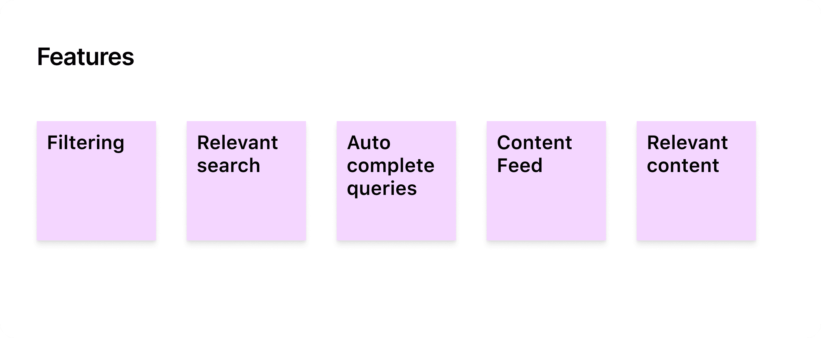
I found out that users were not able to find the search bar. And even when they did, the search results were scattered. Based on these discussions I was able to identify the required features.
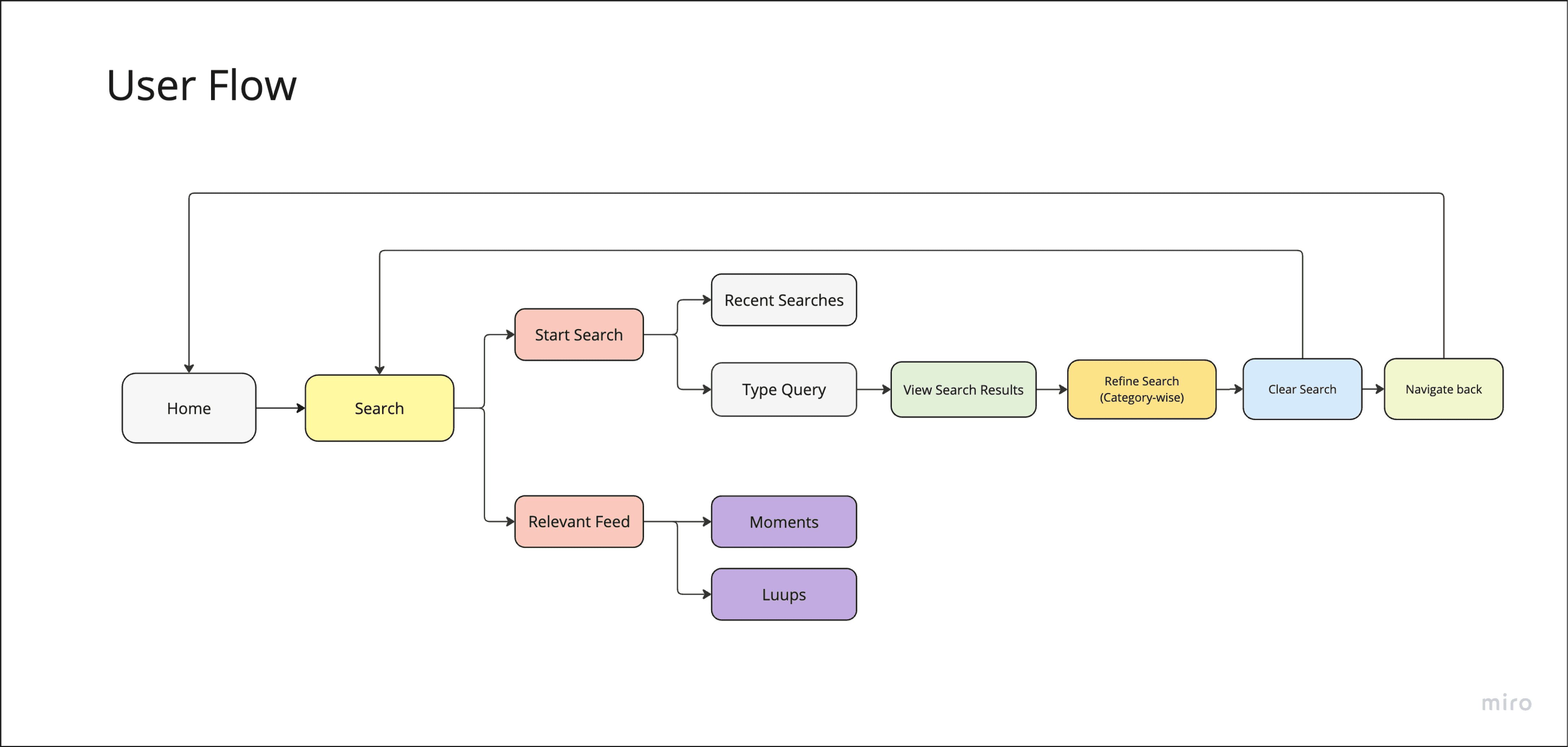
Finalizing the user flow
After this research, I did some desk research by reading about the search features of other social media platforms. Further by mapping out the existing user flow, and identifying pain points and some areas for improvement. This helped me understand the user journey and pinpoint opportunities for streamlining the Search feature. And came up with a new user flow.
I created wireframes to visualize the revised layout. The focus was on simplicity and clarity, ensuring that users could easily search and navigate through the filtering options to discover relevant content.

Hi-Fid Designs and testing
After validating the wireframes from internal stakeholders, I developed high-fidelity designs, refining the visual elements and user interface to create a better experience. The new designs prioritized user engagement, content discovery, and ease of use, with a cleaner and more organized layout.
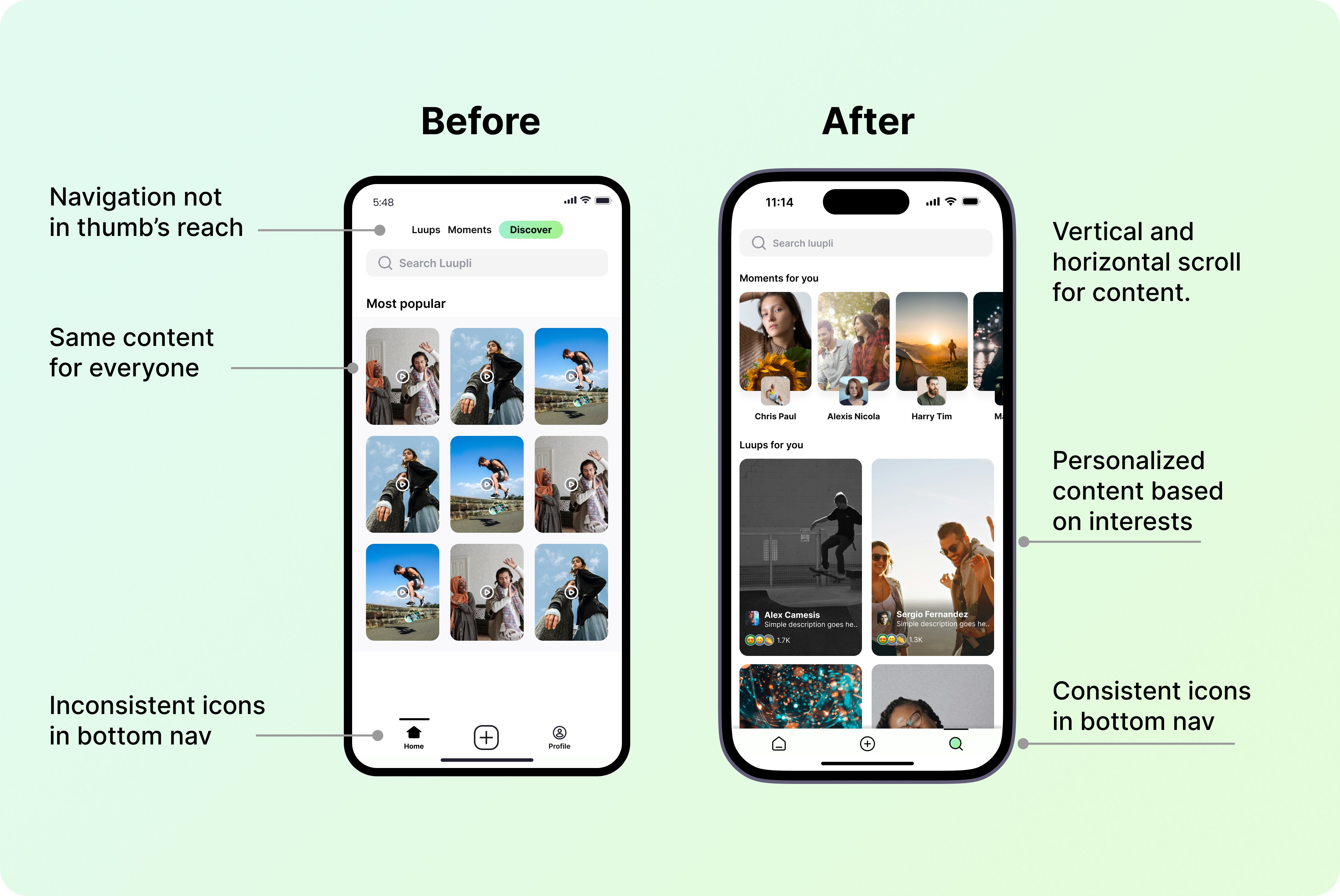
Previously, the most popular content was being shown to every user, but now we are providing the user with the content based on their interests (For You section).
Search/ Discover was previously at the top nav bar but to make it more accessible, we moved it to the bottom nav, replacing it with profile. I tested the prototype with the internal users to validate if it met their needs and if there was space for improvement. Users recommended a few visual preferences, which I included on the screens.

Outcome
The inclusion of filtering tabs and suggestive search fill significantly improved the usability of the Search feature, enhancing content discovery and user satisfaction.
Moving the search feature to the bottom navigation further emphasizes its importance and accessibility, making it easier for users to discover and engage with content. The retention rate after a month increased by 14%.
By continuously gathering feedback and iterating on the feature, I aim to further enhance the user experience and ensure that the platform remains user-friendly and engaging.